
NBCU Academy 101
TV news reports need graphics to convey information. CNBC Graphics’ Senior Designer Christen Barbagallo teaches the Art of Graphics, offering tips to make your show or video more eye-catching.
Simplicity and readability

Readability is key when designing a graphic.
Here’s how to make a graphic readable – and easily digestible:
- Stick to sans serif font families
- Stay concise!
- Keep any text large and simple
- Use a storytelling image if it helps convey the information, but keep the image simple.
Imagine the graphic showing up on screen for three seconds. If the graphic can’t be absorbed in that time, it’s too complex.
Types of graphics
There are many types of graphics in the TV and digital world. CNBC uses two basic ones: fullscreens and halfscreens.
Fullscreens are graphics that take up the entire TV screen, such as quotations text, document headlines or social media posts.
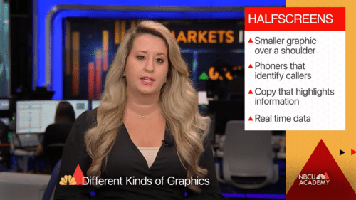
Halfscreens take up half of the screen in order to simultaneously show the anchor or reporter. These can include phoners, which identify the person who is calling in to the show, as well as real-time data or copy that highlight what’s being discussed.
Other high-volume graphics include plasmas or monitor graphics that are shown in a large monitor on the set and can even take up an entire studio wall. These can include interactive monitors, where the anchor draws on top of your graphic, and monitors that offer branding, a tease of the next story or larger infographics.
Data graphics are another large part of the news. They include bar charts, line charts or pie charts. Whenever creating a data graphic, be as accurate as possible. Only give the viewer exactly what they need in order to understand the data. Choose colors that work with the data and imagery that supports the data. Always triple check for accuracy, including spelling.


